2026
ConnectedPartnersReal Estate
A private real estate identity shaped around access, trust, curation and discretion.
- Brand strategy
- Visual identity
- Art direction
A brand that feels closer to a trusted inner circle than a conventional brokerage.
The system turns one precise idea into a complete visual language. A key formed from C and P represents access, relationship and stewardship without relying on familiar real estate clichés.
- Role
- Brand strategy and identity
- Scope
- Voice, logo, system and applications
- Status
- Completed, 2026
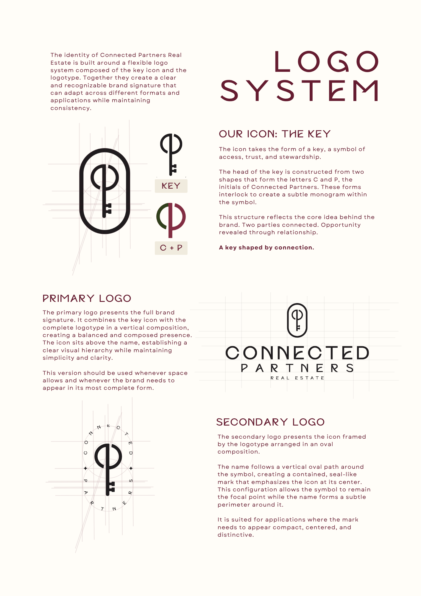
Depth and restraint, tested as a working system.
Select a color to inspect its role. Client colors remain inside the brand module while the portfolio stays black and electric yellow.
ACTIVE TOKENCONNECTED BURGUNDY
Presence, confidence and the central brand signature.
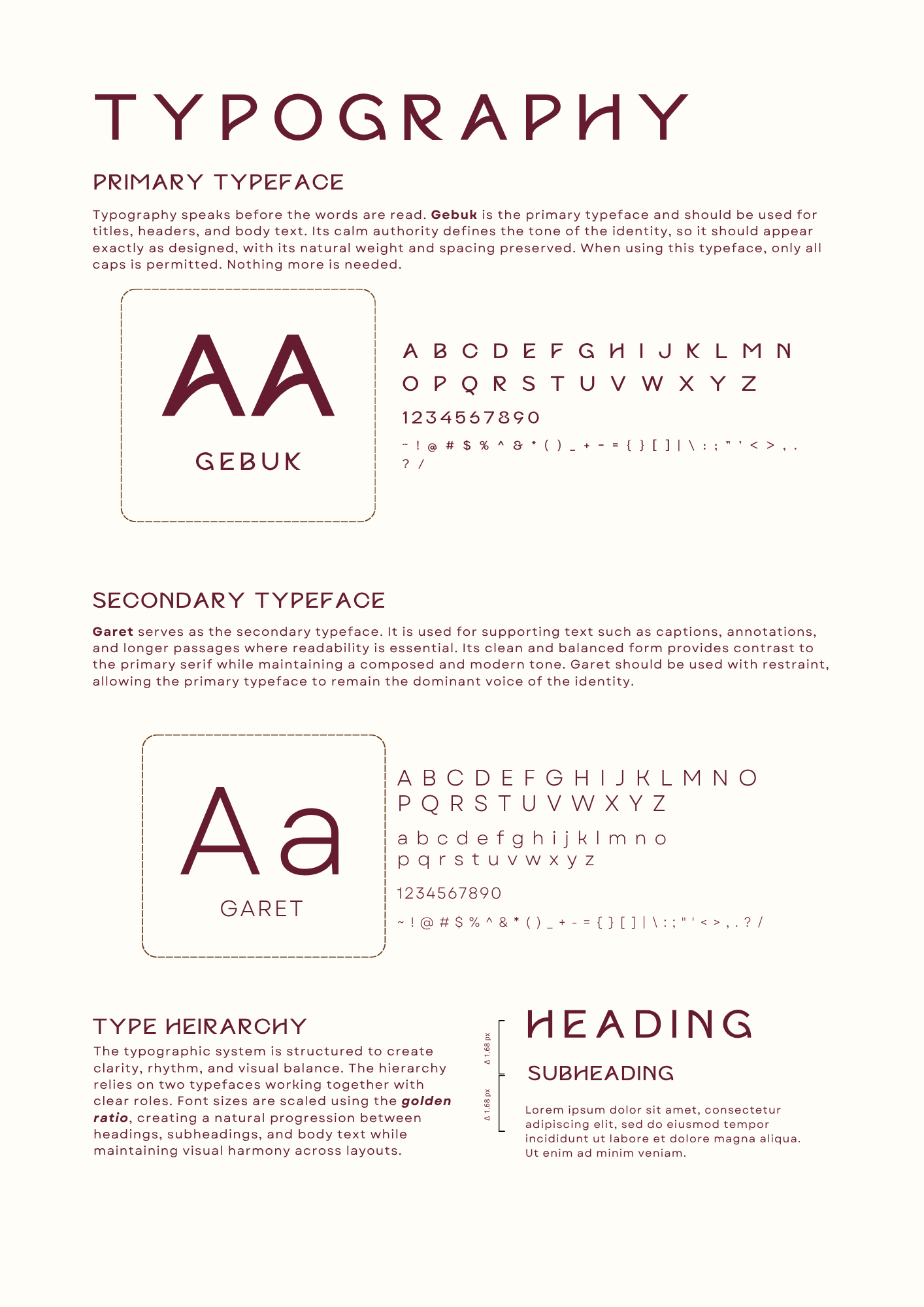
Voice and imagery share the same quiet confidence.
Concise language, architectural stillness and warm material detail create a world that feels discovered rather than advertised.

One identity across every point of contact.
Drag to inspect the supplied application system.
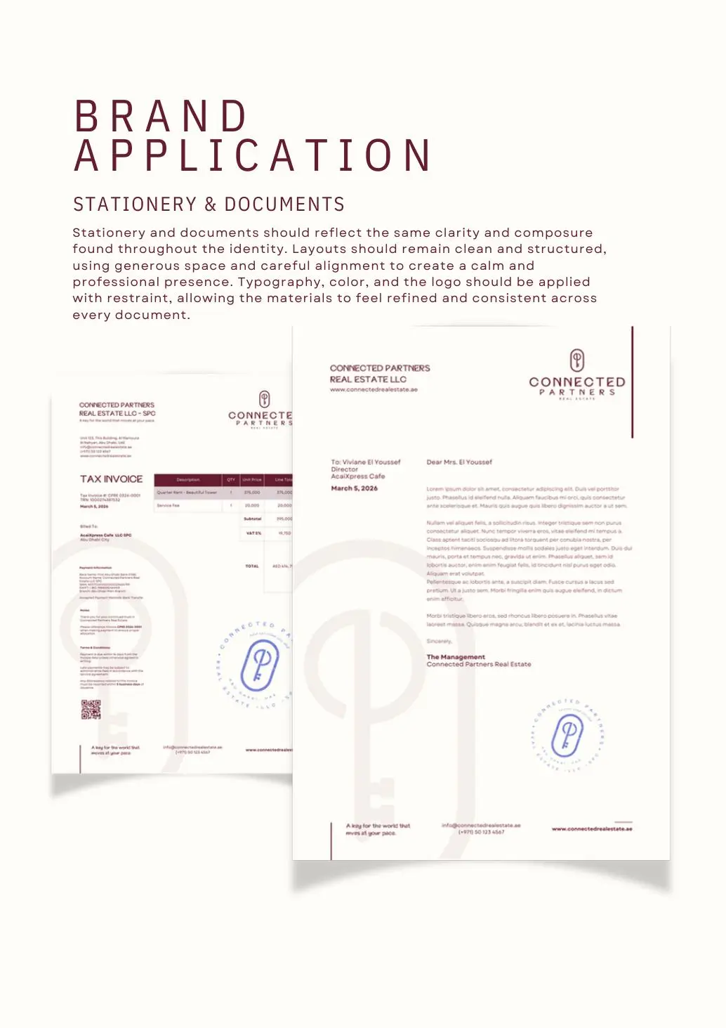
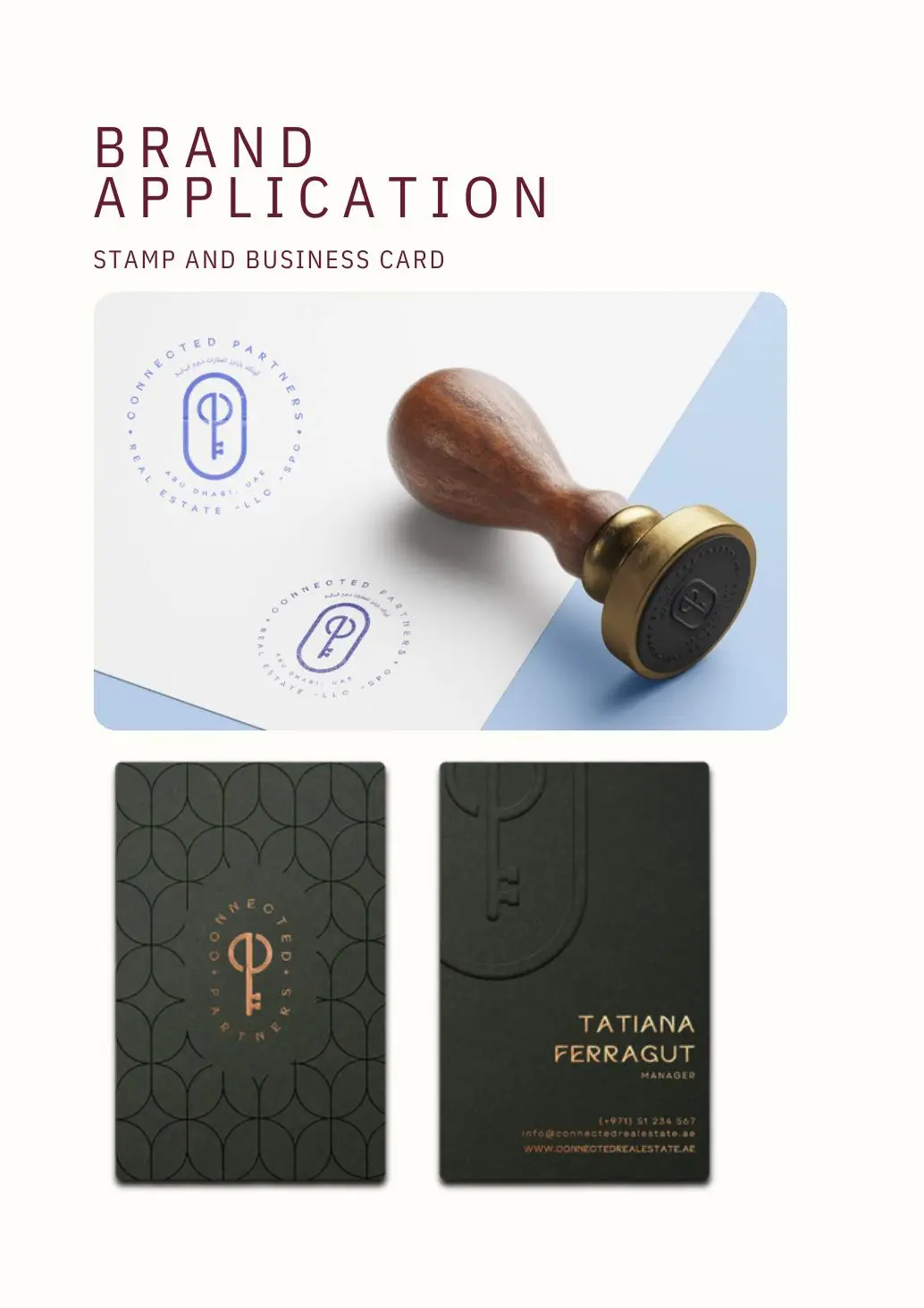
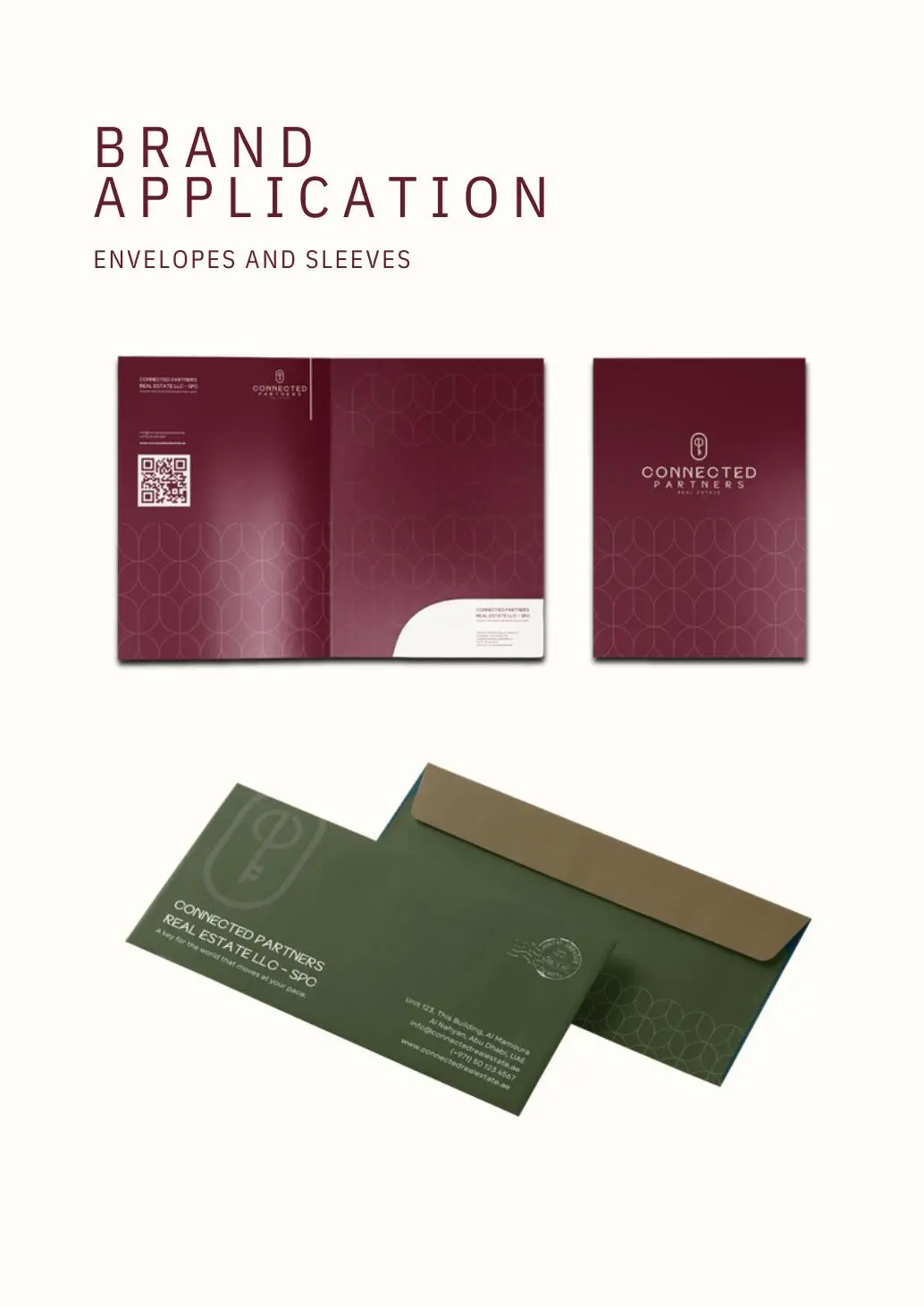
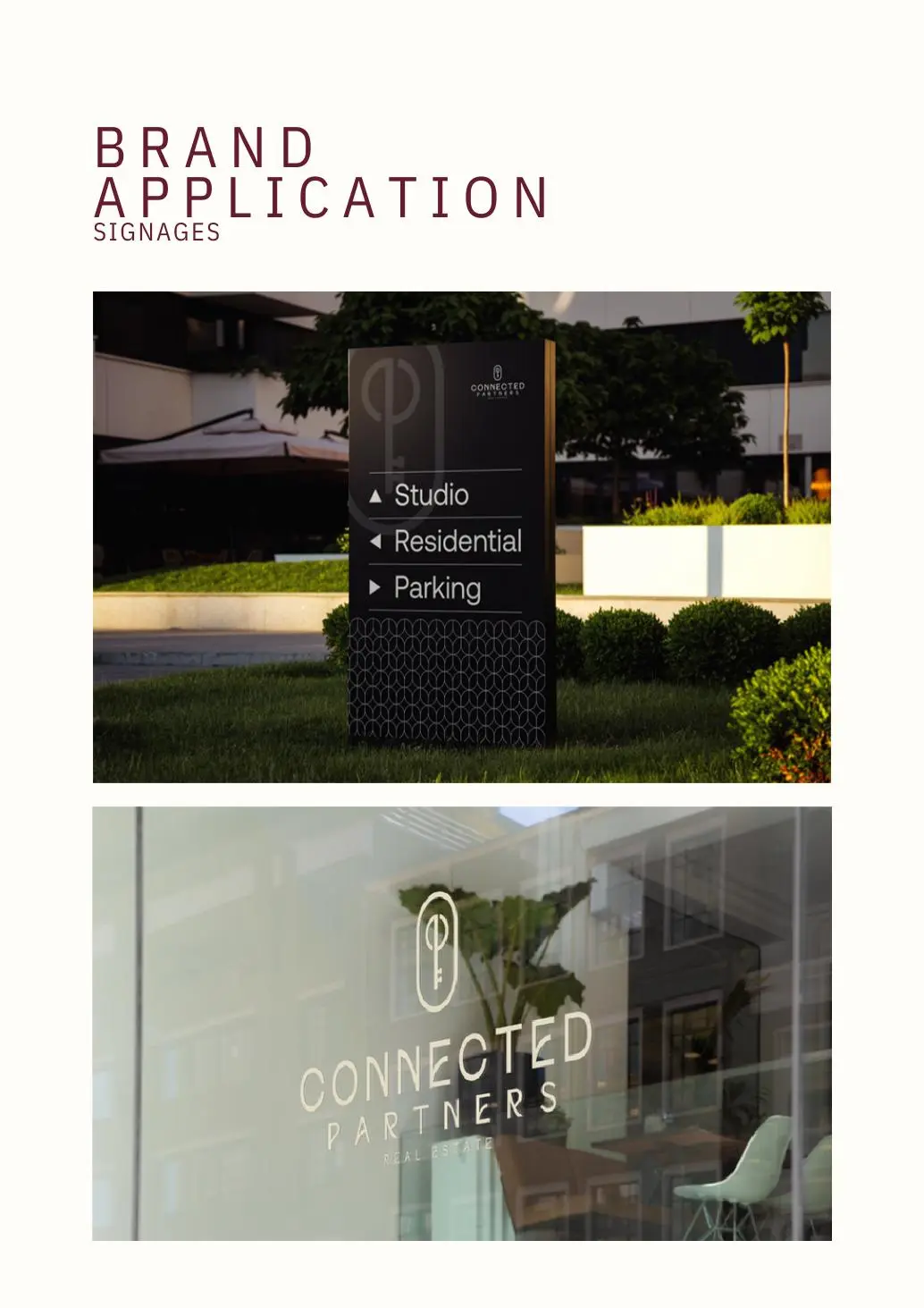
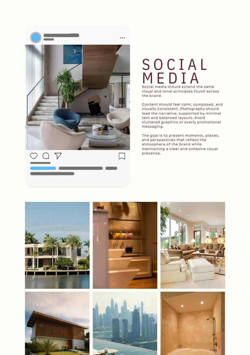
DRAG TO EXPLORE
Strategy, identity and application design.
- Brand positioning
- Messaging system
- Logo construction
- Visual identity
- Art direction
- Brand applications
CONNECTED PARTNERS / 2026
The quiet power of connection.
A complete brand world built from one precise idea.